Avoiding captionitis.
- Stefen
- Jan 19
- 1 min read
Updated: Feb 14
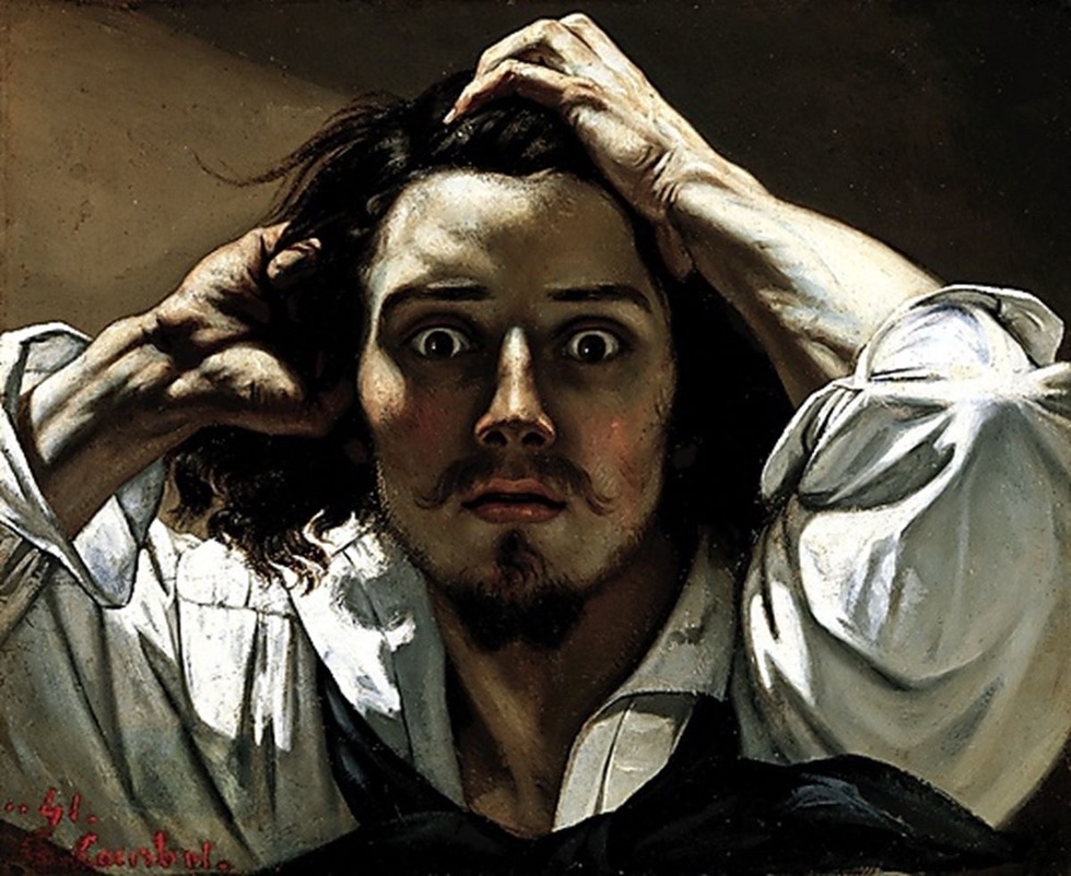
Visiting a recent exhibition, I found myself wondering about the role wall text plays in our viewing experience. You know, the caption on the wall beside the painting? Exactly what value does it add? I look at a picture of a haunch of beef being maneuvered by a group of laborers. I approach the caption to its left only to learn that I am looking at a painting of a haunch of beef being maneuvered by a group of laborers…I’m sorry. What?
Why, oh why, do museum curators have this compulsion to state the obvious? Why can’t they help me to see with fresh eyes? To pull back the curtain on the artist’s technique, share a dose of useful context: did he choose black to match his mood, or because he'd run out of white? Alas, alack, curators seem to be hell bent on beating us over the head with the literal and the mundane.
After forty years navigating captions featuring the underwhelming, and the impenetrable, I avoid the blurb. That includes the stuff in 99 font on the Title Wall, where curators generally take the time to congratulate themselves and tell you what to think.
So I have a challenge for you: On your next visit, make a point of not reading the text, not even the title. Take the time you would otherwise waste filling your brain with inanities, to allow your eyes to rest peaceably on the canvas. That’s what the painter would have wanted.
(If you are suffering from captionitis, or believe you have come into contact with someone who is, consider giving the gift of Stefen and SAM)


Comments